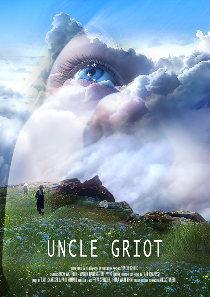
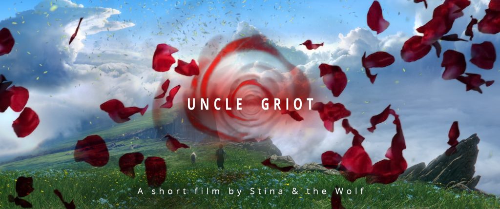
Here’s a behind the scenes video of some of the processes we used to make “Uncle Griot”. It’s accompanied below by an interview I did with the “Florida Animation Festival” about some of our techniques, inspirations and the big challenges we faced in getting it made at all!
FAF: What do you think are the benefits of working in CGI animation? The drawbacks?
PC: I’ve found one of the biggest benefits of working in CGI is also one of its biggest drawbacks. It gives you an almost limitless potential for telling your story in any environment you can possibly imagine (or are yet to imagine) with any characters you want, human or otherwise.
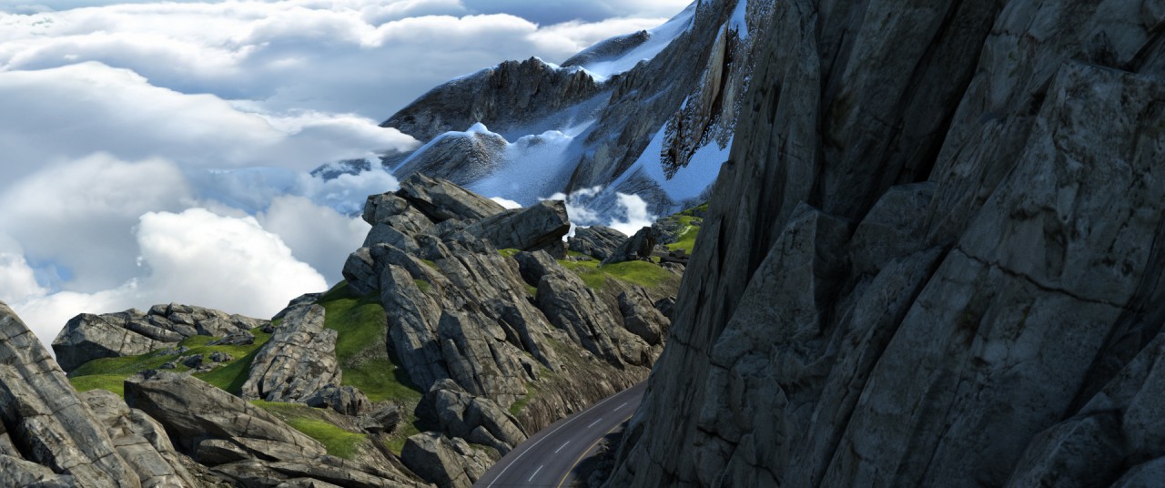
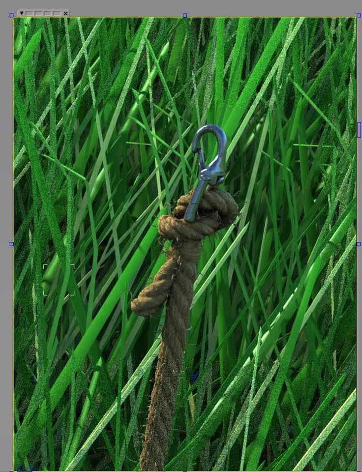
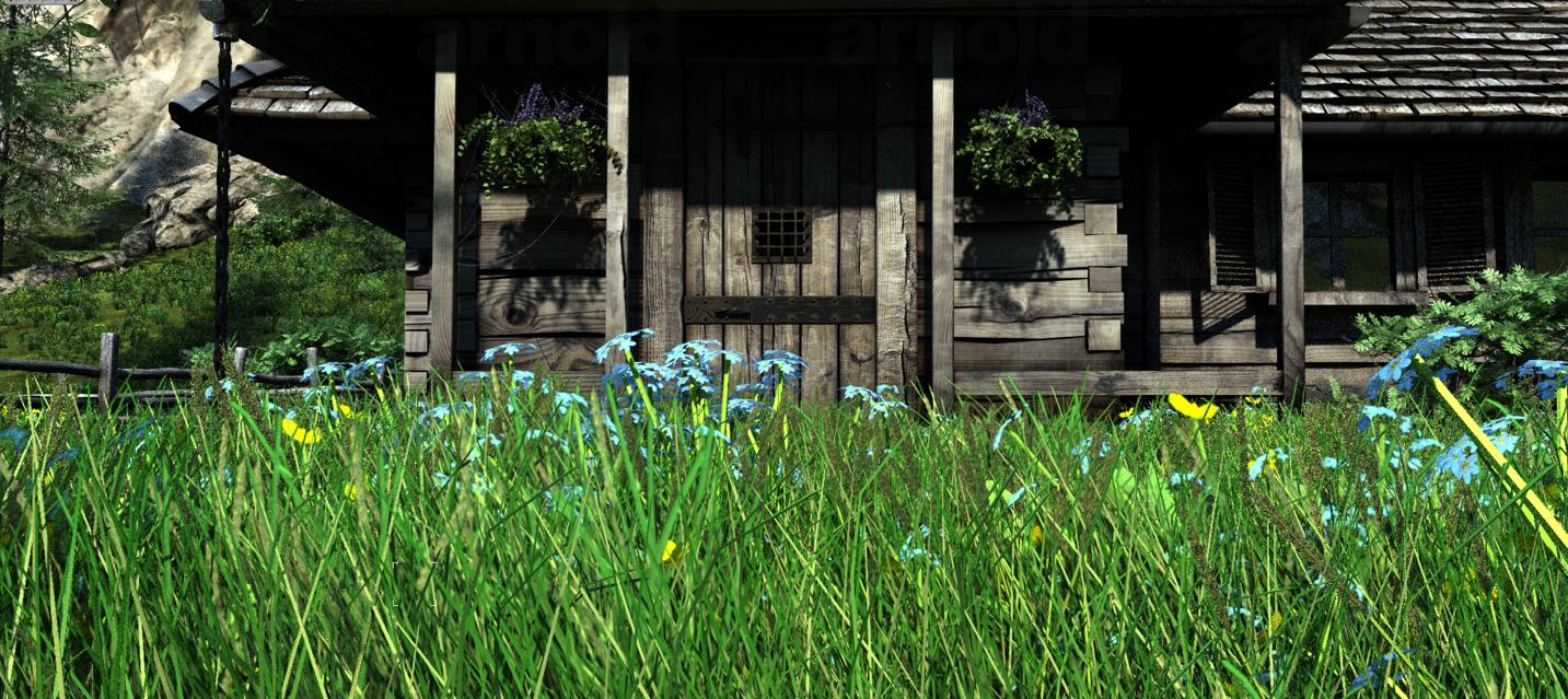
The big danger here is that this lack of creative boundaries can actually hinder rather than help the creative process–particularly if you don’t have a producer constantly reminding you of cost and timescale. They have a way of making you focus on specific choices! We found this problem especially true with the outdoor natural environments. For conventional filmmaking, there’s a certain amount of design in the environment at the pre-production stage and much of that you can get from location scouting. But the key difference here is that the final cinematographic process is also very reactive to the pre-existing design (i.e. the natural world). The director can react on set to light and form by just moving around. It’s a reactive as well as a prescriptive process. The problem with CGI landscape design is that it’s entirely design driven by concept art. Even if you start from photos or paintings, you have to build the landscape in a way that works from multiple angles, so it’s very easy to lose that important ability that I believe is essential to good art: reacting to things beyond your control, to mistakes as well as external agents and limitations. I’ve seen it with professional feature directors (and myself). You can end up with a “kid-in-the-candy-store” effect where too much choice means you ended up piling too many things in, or getting distracted by some other cool idea you suddenly realise is possible. In my opinion, this is one of the reasons a lot of CGI can sometimes look flat, contrived and uninspired. It’s over-designed. Our issue was how do we make the environment in a way that we can react to it as if we are on set? We never answered this problem completely in my opinion, although I’m mostly very happy with our landscape; but we had to do a lot of very time-consuming set dressing and landscape design per shot to camera. (Matte painting can be a savior in these instances if you have only a small amount of parallax or a static camera.) For our next project, the feature film that the short was developed from, we are planning to use as much real life scan data as we can as a starting point and also plan our shots using a game engine such as UNREAL. We are hoping this will give us the ability to throw ourselves into a world where we can react to colour, light, and form as well as design it.
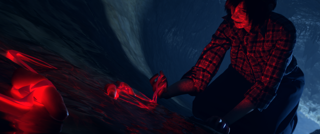
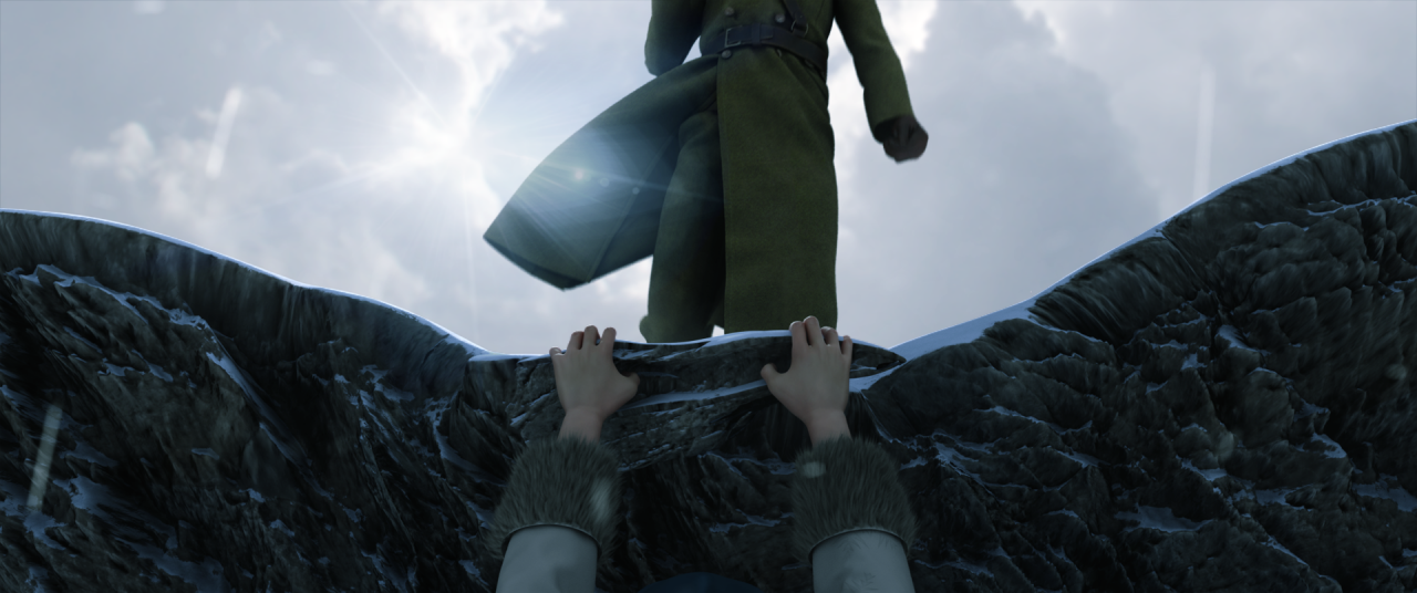
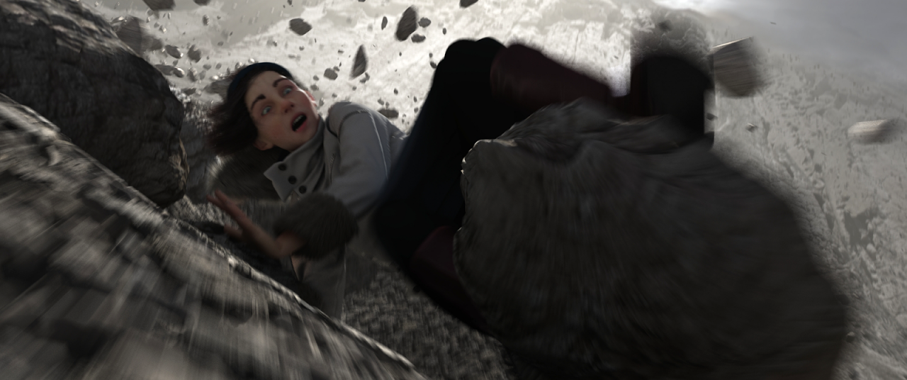
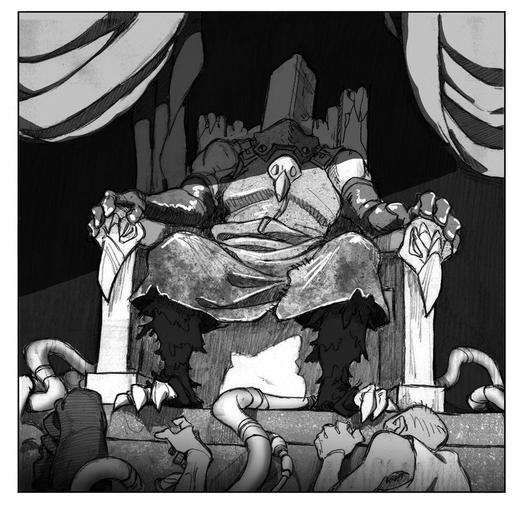
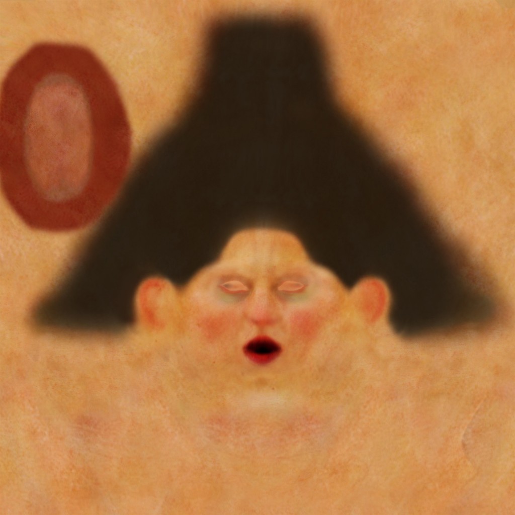
In many respects we are using CGI to mimic a real film process, as that fits our narrative style of magical realism. It also gives us a fairly unique approach to our shot design. We captured all the performances on set in a similar way to a stage play. We had limited space so we concentrated on getting the best, most honest performance we could with only minimal blocking for camera. Our plan was always to try and react to the performances in post and frame and edit shots accordingly. This gave us a lot of freedom to build edits based on beats coming directly from the performance, and also overcome the restrictions of the performance space. This is, as far as I know, an untested approach, as the editing of a shoot, is normally restricted by the camera coverage, or by each shot being blocked specifically for a single camera. We had complete freedom to put the cameras anywhere we wanted after the shoot. It allowed us to have more improvised, as well as heavily scripted scenes which really helped us get the most out of our child actors, as the physical blocking for camera was less of an issue. You can see this particularly in our “Uncle Griot” short, where the interaction between the four-legged Griot (played as a reference for the animators by me crawling around on set) and Stina was largely improvised. This process allowed us to then rebuild the performances with basic previz rigs and apply our “egg head” models: projected facial performances from the actors head cams. We could then review the scenes and try and frame and edit shots sympathetically to the performances and our narrative intentions. This freedom also had its drawbacks though, as you need to be very clear on the intent of every shot, as the infinite potential can be completely overwhelming!
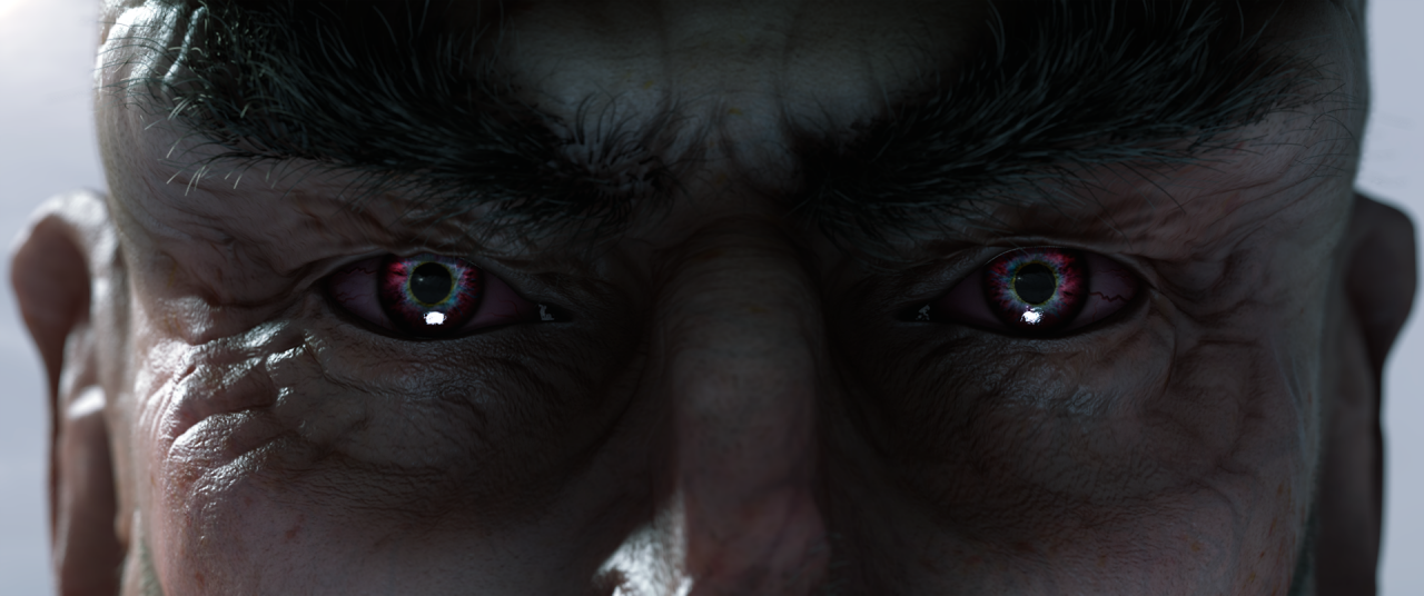
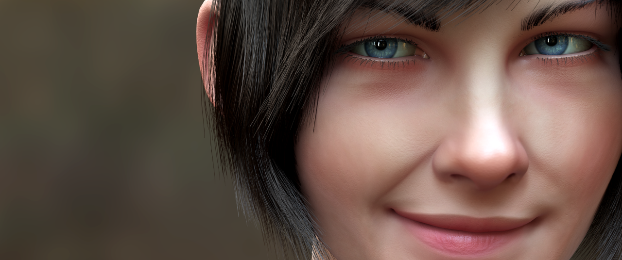
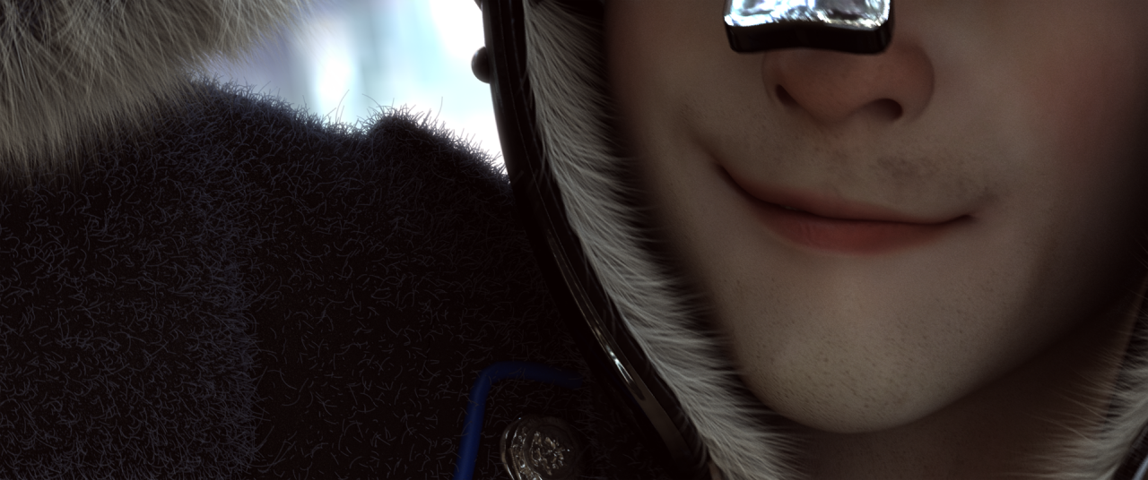
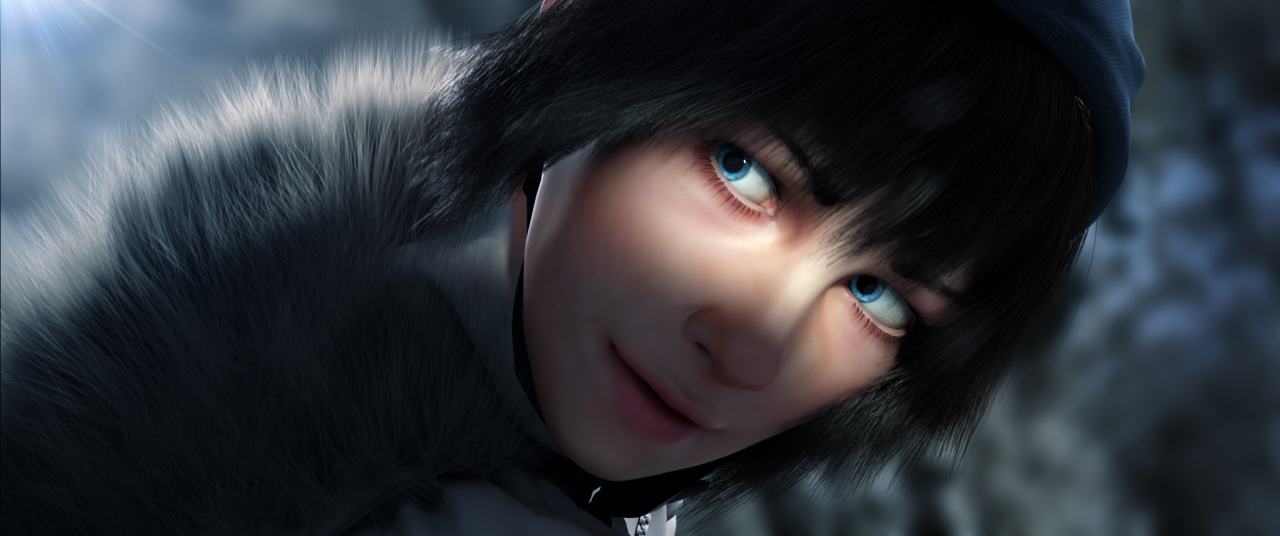
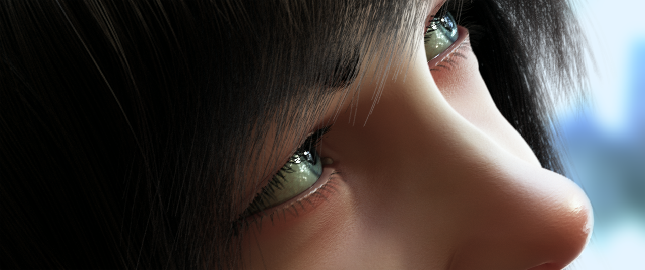
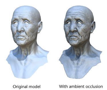
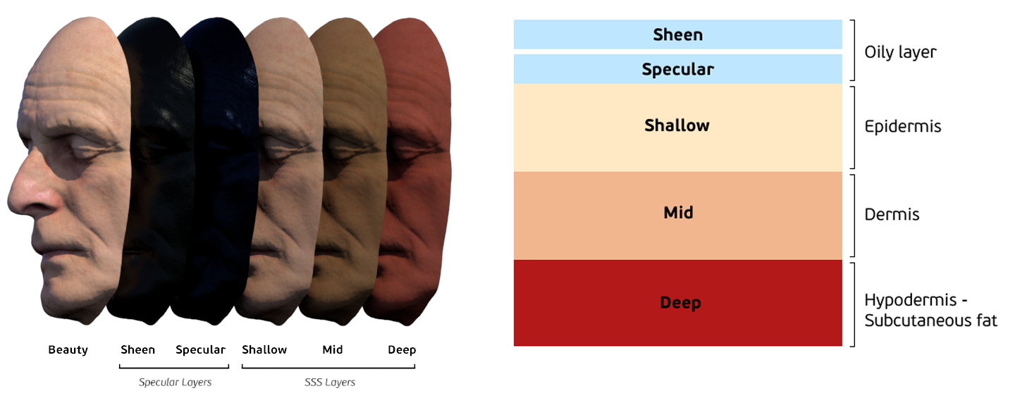
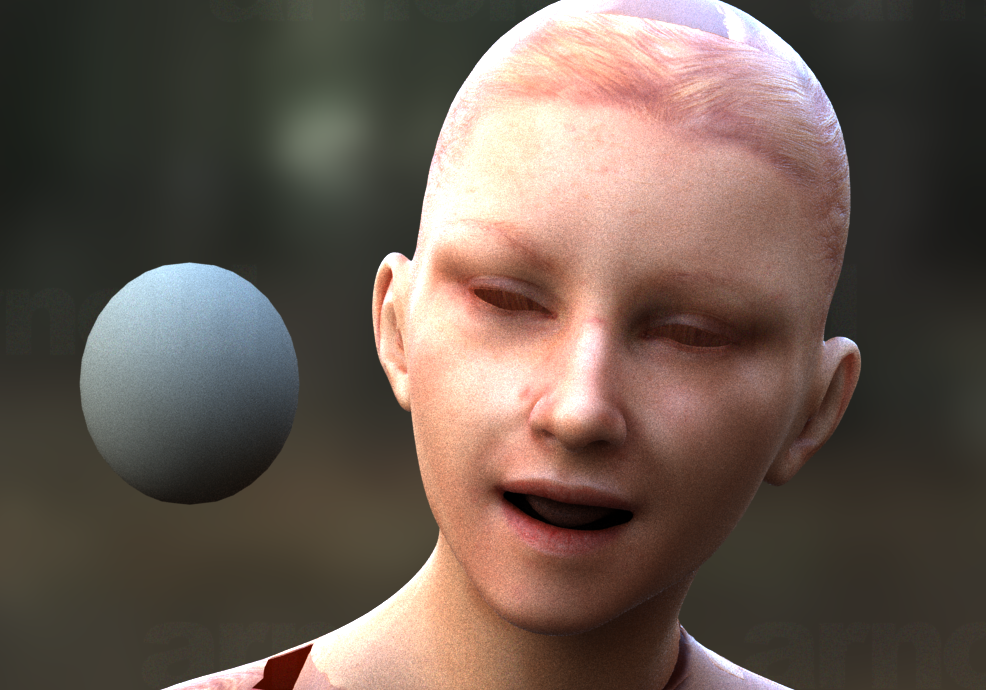
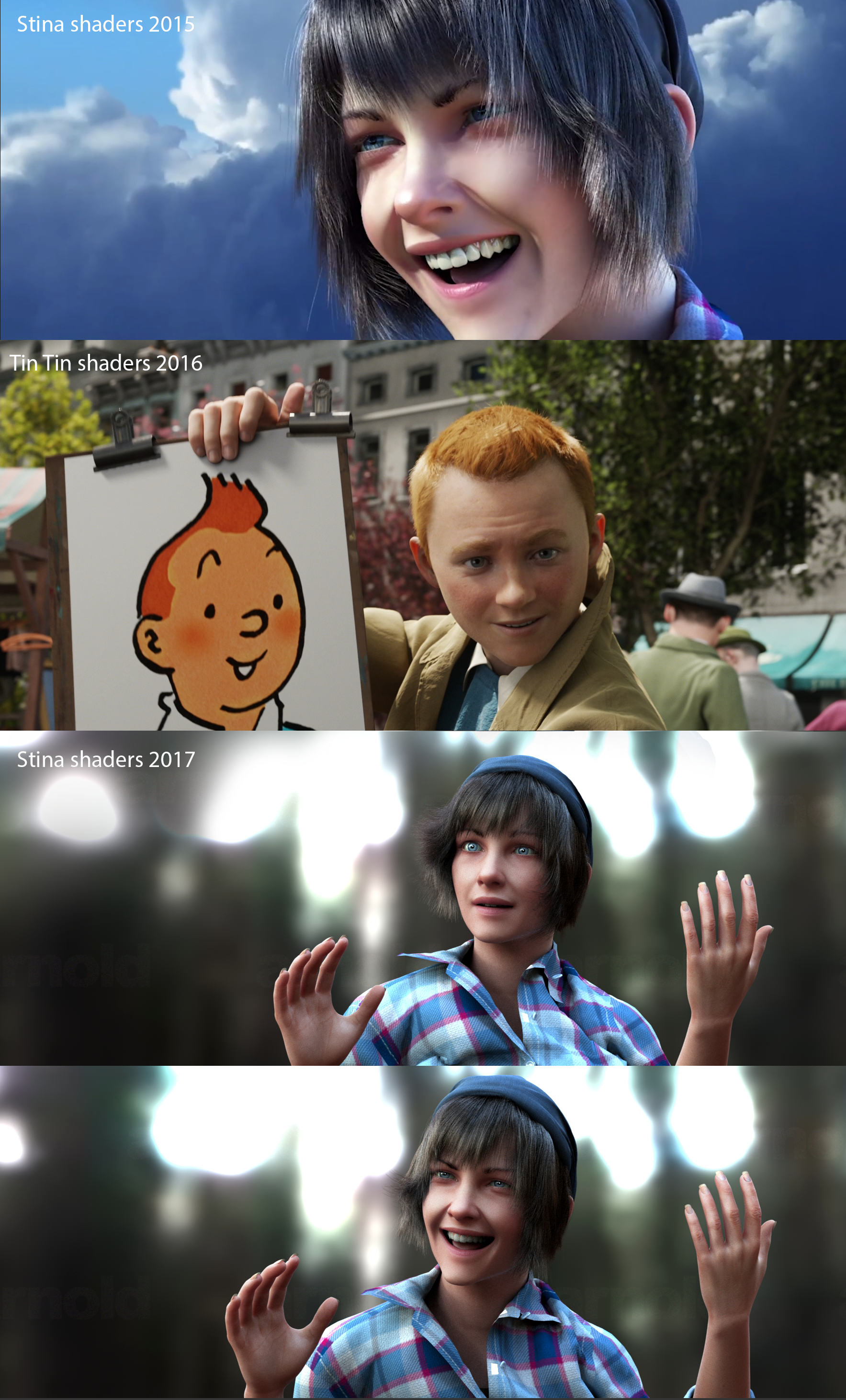
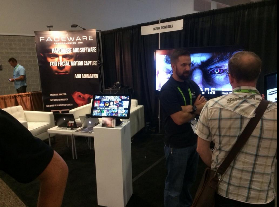
From a technical point of view, the biggest hurdle with this kind of high realism CGI is faces (in our case we were not going for photo real, but idealised). Doing it well gives you the chance to really communicate some subtle and nuanced performance beats, but it also requires a lot of work. As someone who has a lot of experience in the realistic facial animation process, (having worked professionally animating “Gollum” on “Lord of the Rings” as well as other characters) I knew how challenging it was and built a very detailed and realistic facial animation system before we even planned the shoot. We used blend shapes and other rigging tools and based it on the Facial Acting Coding system of Dr. Paul Ekman (this forms the basis of most film industry facial animation systems) This is essentially a sculpting task and requires good observation skills and a lot of patience. The next stage was translating the performances from the actors’ faces onto the rig. This required the best quality locked-off video we could get. (we got this by making our own face cams from a weightlifters neck rig and some webcams, all very Heath Robinson, but it did the job!) The next challenge was copying this data onto the rigs. We used FACEWARE software to do the first pass. And then did a pass of hand keying to finesse it. There is as yet no quick way to automate this process completely and it’s our biggest concern for the full feature development we are currently planning. (Even the big studios have admitted it always comes back to hand keying at some point. There is, as yet, no real substitute for the animator’s eye!)
FAF: Watching your behind the scenes video, I was awestruck by the use of light in your film. Can you talk a little about this?
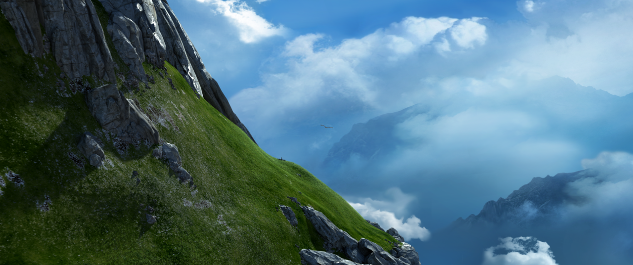
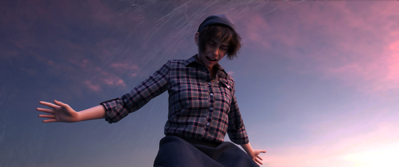
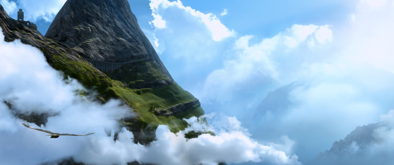
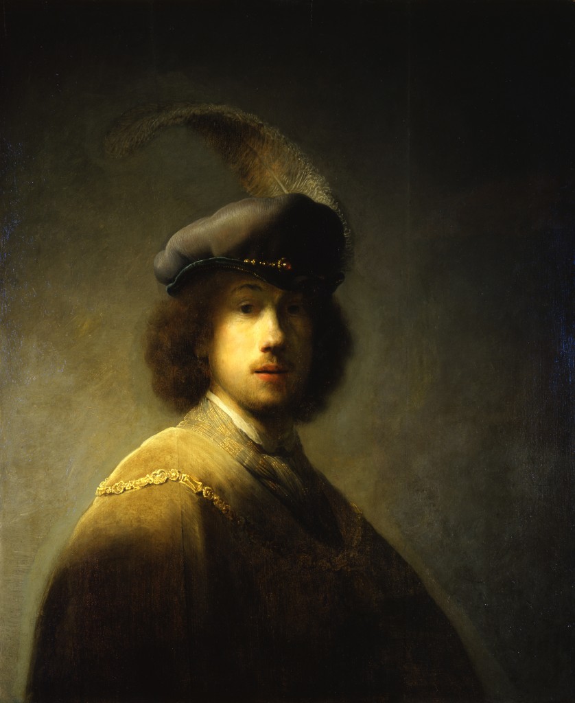
PC: The world of our film exists in a place between reality and dreams. The mountains Stina inhabits are above the cloud layer, with nothing but the sun, a thin atmosphere, and stars above her. We wanted a dreamlike quality to the light. As well as being very influenced by the dreamlike, light-soaked cinematography of Terrence Malick, a big reference for us was sunlight as seen in space. We particularly wanted to get the prismatic effect of light breaking into its component parts. We used the “light leak” trick, often seen in film these days to try and get this effect. Some of it was done in post using Nuke and reacted procedurally to the light in the rendered frames, whereas other times we used stock footage of light leaks through real camera lenses composited over the renders. In each case, we processed the effect to try and amplify the prismatic separation. I also noticed that when you split out the prismatic colours of white light, even subtly, it really seems to give the colours in your image a lot more vibrancy, and I think this helped with the dream-like effect.
Our feature has a specific colour design journey that develops with the story, and as this short was taken from our feature project, we also used that to hold with the lighting design. At this stage in the film we wanted to get a real feeling of space, sky, and sun and the sense of infinite possibility this can give, as this reflects Stina’s point in her story arc. We tried to keep the horizon clear in most shots, allowing as much blue light from our sky (projected by an HDRI dome light) and have this contrasting vibrantly with a lemon-tinted sun. This also allowed us to make the most of reflections from our environment cloud map, which we moved slightly for composition every shot.
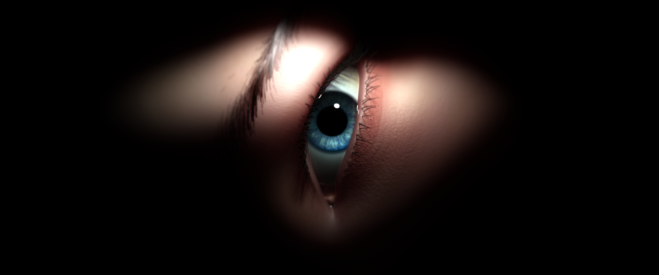
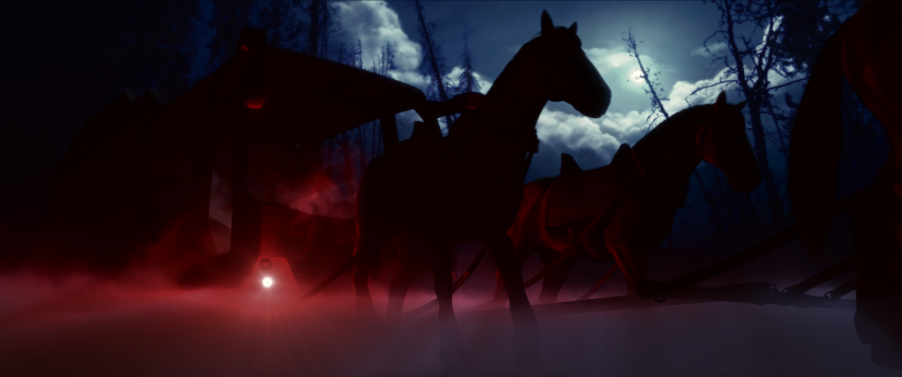
As we wanted a “filmic” look we also tried to mimic the onset film lighting process. Our render engine: Arnold, allowed us to use 3D modeled bounce boards. We physically placed them in the scene to add fill light bounced up from the sun. We also deliberately used the real-life limitations of keeping them out of shot and having to move them along with the actors. We also added ”beauty” lighting with spot and rims to amplify the staging for the close-ups and get that characteristic eye-lit effect you see in glossy Hollywood films. We set these lights up after getting the environment lighting how we wanted it, so again this allowed us to mimic the process of real on set lighting.
One of the advances we are really hoping to make for our next stage in the feature production is recreating as much of this lighting process as possible in a game engine. We are hoping this will give us a much clearer sense of the final look at a previz stage, which means less (costly) revisions when we do the final lighting. It would be amazing to set up a reactive environment that we could experiment in and it would also help us make the process as organic as possible.

